


The Colors We’re About to See Everywhere in 2027

The 2027 Color Trends Are Getting Warmer
Color is having a moment again, and the 2027 color trends beginning to emerge aren’t necessarily bright, obvious, or overly saturated. They’re earthier, muddier, richer, and a little more complicated. After years of gray, white, beige, and relatively safe palettes dominating interiors, I think people are ready to be more adventurous. They want warmth and character, and they want their homes to feel different from every other house they’ve scrolled past.
While paint is usually where the conversation about color begins, that isn’t necessarily where I’m most excited to see these shades. I’m thinking about cabinetry, tile, natural stone, upholstery, wallpaper, textiles, wood tones, and even plumbing fixtures. Of all the 2027 color trends beginning to take shape, these are the five color families I expect to see much more of in the year ahead.
Mossy Olive Green
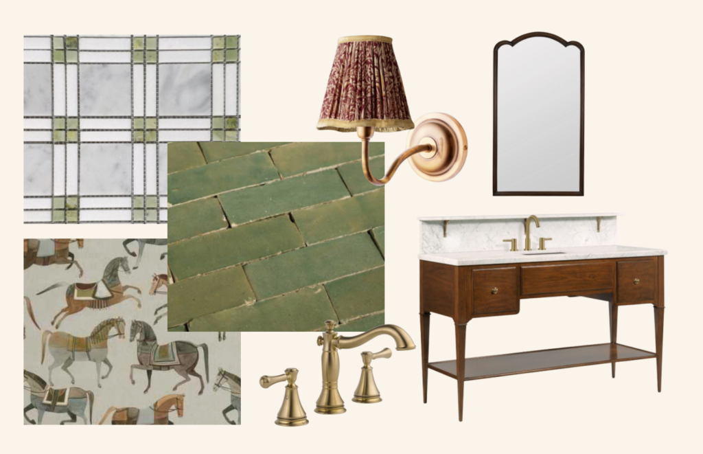
Green certainly isn’t new to interiors, but it’s beginning to move away from the soft sage greens that have dominated the past several years and into something earthier. Think moss, olive, loden, and greens with noticeably brown or yellow undertones. I think this shift takes us even closer to nature and gives green a moodier quality. While sage tends to pair naturally with blues, corals, and softer pastels, these muddier greens work beautifully alongside warmer, richer colors like ochre yellow, brick red, chocolate brown, plum, and even a dark purple.
It’s also an incredibly versatile color. I would use mossy olive on bathroom tile, a vanity, wallpaper, ceilings, trim, or throughout an entire color-drenched room. I especially love it when there is pattern involved somewhere in the space, whether that comes through drapery, pillows, wallpaper, or another textile. There really isn’t a room where I’d rule it out.
Although we’re calling mossy olive a 2027 trend, there’s nothing particularly new about the color itself. I see versions of it frequently in historic homes throughout the Brandywine Valley and Valley Forge, and in homes with long, storied pasts. That’s an important distinction when talking about color trends. Any color can become popular for a period and eventually fall out of favor, but that doesn’t mean the color itself belongs to that decade. All colors have history, and many of the ones we’re embracing again have been used beautifully for centuries. Color isn’t the only place we’re seeing the past influence today’s interiors. We’re also watching several once-outdated kitchen trends make their way back into homes in completely new ways.
If you’re interested in bringing this color into your own home, two shades that capture the direction particularly well are Sherwin-Williams Oakmoss SW 6180 and Benjamin Moore Dill Pickle 2147-40. Oakmoss offers the deeper, earthier side of the family, while Dill Pickle leans more toward that yellowed olive quality that separates these greens from the sages we’ve been seeing.
Oxblood & Wine
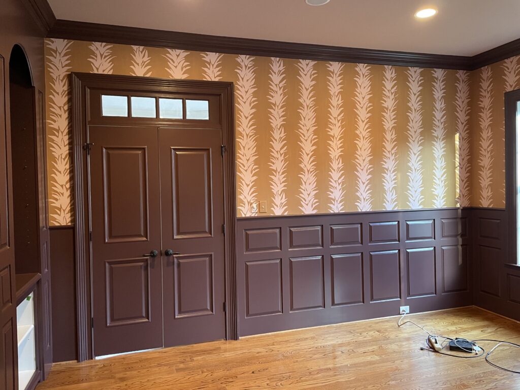
Oxblood and wine take us somewhere darker. These deep reds feel intimate, warm, and inviting, and while they can certainly make a room feel heavier, I think that’s exactly what makes them so compelling in the right setting. Whether I would make one the dominant color or use it as an accent would depend entirely on what I’m trying to accomplish. If the goal is a dark, moody room, I would have no hesitation going all in. If I’m creating something brighter and livelier, I would use the same color in smaller doses.
I’d particularly love to see this color make its way onto cabinetry. Deep reds already work beautifully in color-drenched offices, speakeasy-inspired spaces, and entertainment rooms, and I think a theater room would be an incredible place to use one. I’d surround it with wallpaper and plenty of textiles, incorporate brass or bronze metals, and bring in colors like plum or royal blue to make the palette even richer.
This is also a color family I expect homeowners to be hesitant about. Red, yellow, and orange are consistently the colors I see listed as a “no” most often on our client questionnaires. I think many people have a preconceived idea of what a red room looks like, and it usually isn’t the version I’m envisioning. With the right shade, materials, and application, though, I think I could convince just about anyone that a deep wine or oxblood can be incredibly sophisticated. Sherwin-Williams Sommelier SW 7595 and Benjamin Moore Ruby Dusk 1267 are two beautiful places to start if you want to see this side of red.
Earthy Rose
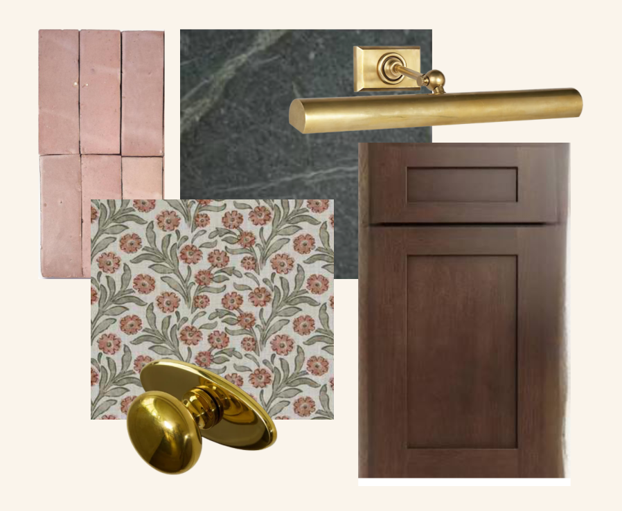
Nothing makes me happier than seeing rose emerge as one of the 2027 color trends. Pink is my favorite color, and I’ve been dying to use more of it for as long as I’ve been a designer. What makes this particular interpretation so interesting is the introduction of brown, clay, and plaster undertones. Those earthier qualities make pink considerably more versatile and easier to make sense of in a variety of spaces. In the right shade, I would even treat earthy rose almost as a neutral.
I’d love to see it used on a backsplash, bathroom tile, or even plumbing fixtures. Kohler’s Memoirs collection has offered a rose-colored toilet and pedestal sink, which is exactly the kind of application that makes this trend interesting to me. It isn’t simply about painting a bedroom pink. It’s about reconsidering where the color can live and what materials it can be expressed through.
I also suspect this will be the color homeowners are most hesitant to embrace, particularly men who hear “pink” and immediately think feminine, or anyone still traumatized by the old pink bathroom they couldn’t wait to tear out. But an earthy rose surrounded by natural materials doesn’t have to feel feminine at all. Pair it with brown, black, deep red, natural stone, and rich wood, and it becomes sophisticated, earthy, and much moodier than most people expect from pink. Benjamin Moore Venetian Portico AF-185 and Sherwin-Williams Redend Point SW 9081 are both great examples. Venetian Portico moves toward clay, while Redend Point has that pinky-brown quality that demonstrates how easily rose can begin to function as a neutral.
Tobacco & Chocolate Brown
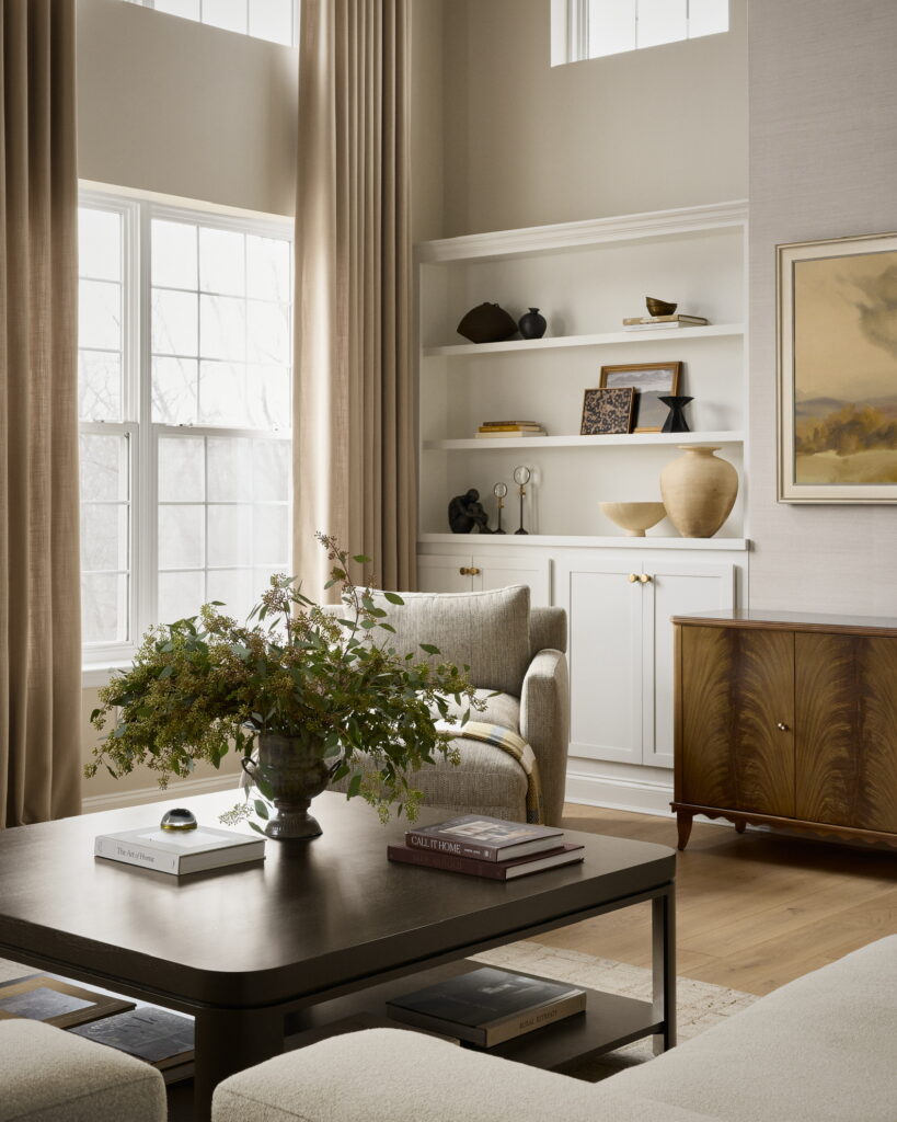
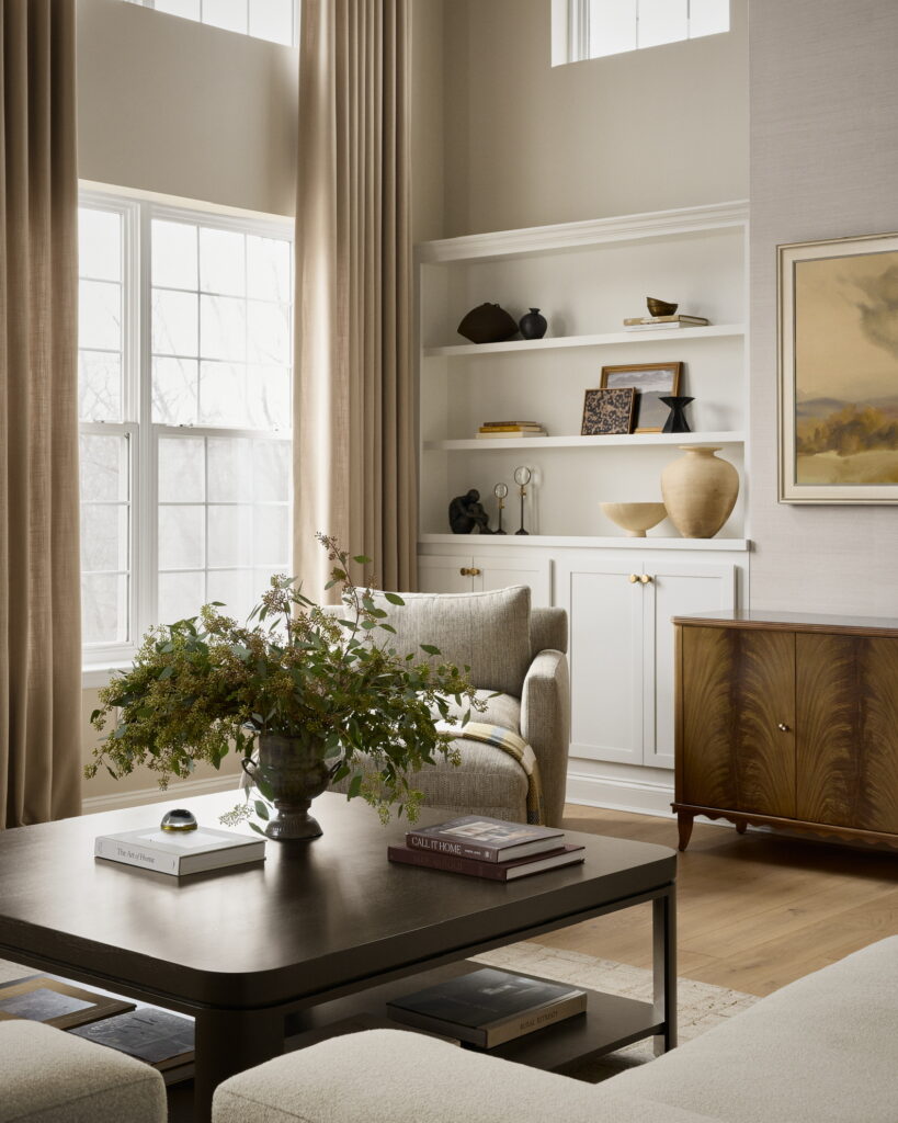
I think people are coming back to brown because they’re cold, tired, and depressed from millennial gray. After years of gray floors, gray walls, gray cabinetry, and gray furniture, it’s not particularly surprising that interiors are moving back toward colors and materials that make a room feel warm again. Brown gives a room warmth and richness in a way that gray simply doesn’t. Gray can leave a space feeling drab and empty, while brown has an inherent depth to it.
Unlike some of the other colors on this list, I don’t really consider brown inherently trendy. When it’s used correctly, particularly through natural materials, it’s timeless. What excites me most about this direction isn’t necessarily brown paint. It’s rich, dark wood. I want to see walnut cabinetry, dark oak floors, beautiful brown stones with natural contrast, leather, and materials that become even richer as they age.
Using those natural materials is also how I would keep a brown room from becoming too heavy. Deep wood and stone paired with lighter, airier colors and materials create contrast rather than darkness for darkness’s sake. If you do want to explore the color through paint, Sherwin-Williams Rookwood Dark Brown SW 2808 and Benjamin Moore Tarpley Brown CW-170 are two great examples. I especially love that both have historical connections because they reinforce exactly what I mean when I say brown isn’t new. It’s simply having another moment.
Smoky Blue
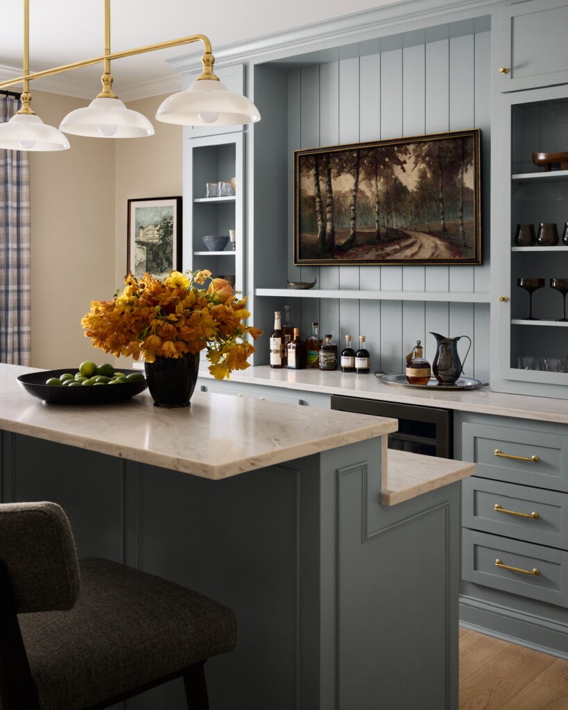
Blue has been part of interiors for a long time, and navy cabinetry in particular has been everywhere for years. What feels different now is the type of blue we’re seeing. Smoky, slate, and dusty blues have a lighter, airier quality than navy without becoming pastel. Slate and dusty blue appeal to me the most because I almost consider them neutrals. They’re incredibly easy to pair with other colors, woods, stones, and patterns.
A dusty blue is one of those colors I would put just about anywhere. I’d use it on cabinetry, bathroom vanities, tile, fabric, wallpaper, or paint. The key is what surrounds it. If you’re worried about blue feeling coastal, I would avoid the combinations that immediately push it in that direction and instead pair it with natural materials, darker contrasting finishes, and classic, traditional forms. The same blue can take on an entirely different identity depending on the context around it.
Sherwin-Williams Stardew SW 9138 and Benjamin Moore Dusty Cornflower both capture the softer blue direction I’m talking about. They introduce noticeable color without the weight of navy, and they have enough subtlety to work almost anywhere I would typically consider using a neutral.
What the 2027 Color Trends Tell Us About Where Interiors Are Headed
When I look at these five colors together, what interests me most isn’t whether moss green or earthy rose ultimately becomes the biggest color of 2027. It’s what they collectively say about where interiors are headed. I think people are feeling more adventurous, and they’re increasingly interested in creating homes that feel individual rather than simply safe. After years of millennial gray and rooms designed around broad resale appeal, there seems to be a greater willingness to choose colors because they make a home interesting, warm, and specific to the people living there.
Mossy olive, oxblood, earthy rose, chocolate brown, and smoky blue may all be colors we’re expecting to see more of in 2027, but none of them were invented for 2027. They’ve existed in beautiful interiors before us, and they’ll exist in beautiful interiors long after the trend forecasts move on. That’s ultimately how I prefer to think about trends. I’m much less interested in choosing something simply because it’s popular than I am in recognizing when the design world is giving us permission to look at an old color in a new way.


Be the first to comment